Version 1.4.0 offers some new and exciting additions to ServicePlanner.
Inbuilt Web Browser
You can now share your favourite websites directly from within ServicePlanner. The ServicePlanner browser offers a minimal user interface that gets out of the way of the content you want to share. The browser offers the following features:
- You can access it from the Today screen or from the Library. Click the globe icon to open the browser.
- The browser should be very familiar as it is based on the Safari browser UI.
- In the top input bar you can type in a search phrase to search using Google, or type in a website URL to directly load the website (eg “tv.jw.org”)
- Click the “…” button top/left to Bookmark your favourite websites, making it easy to directly access the website in the future.
- When you add a Bookmark, the website favicon is automatically detected, similar to how any browser detects the favicon.
- Bookmarks can be viewed in Grid or List View. In the Grid View you can tap+hold on a Bookmark icon to edit.
- In List View you can reorder the Bookmarks.
- If you are looking at a page on tv.jw.org, supported videos are detected and can be saved to the app from the top/left “…” button menu.
- Swipe left / right to move forward and back through your browser history.
Reader View Available
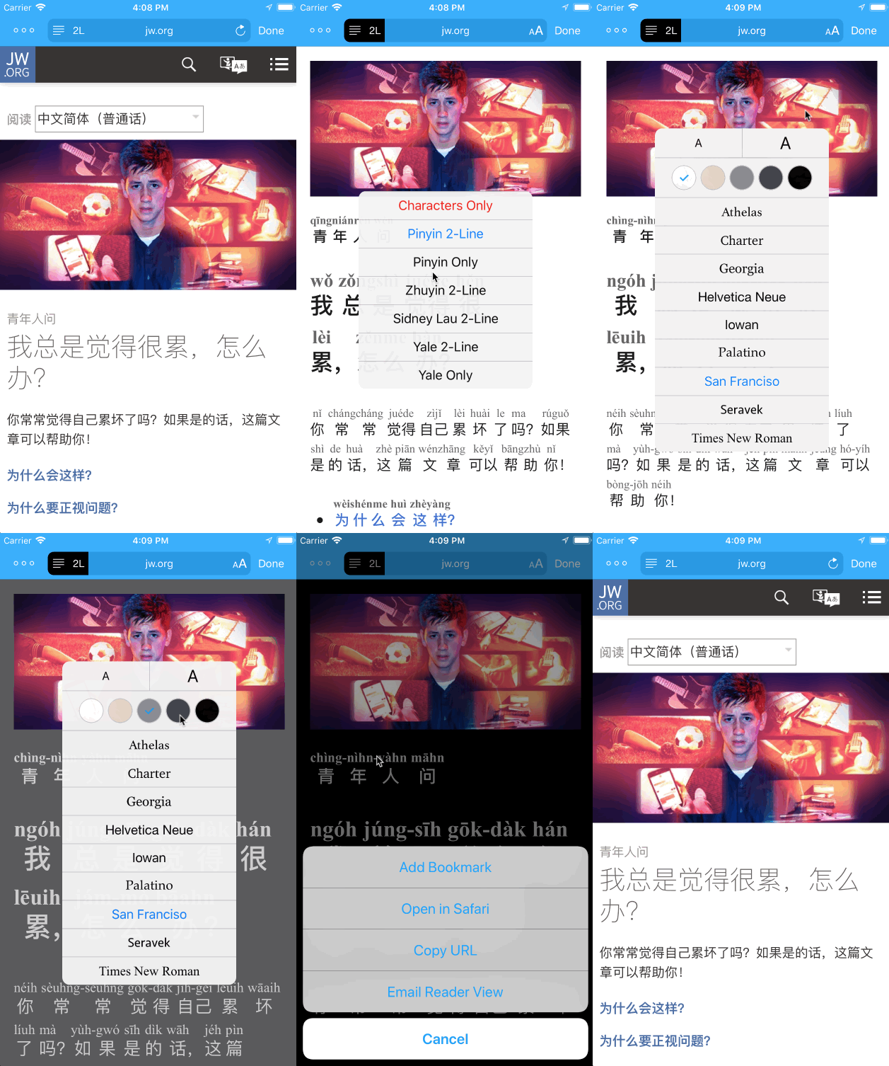
Similar to the Safari and Firefox browsers, ServicePlanner offers a “Reader View” for supported web pages. Reader View removes clutter from the surrounding page and makes the main content of the page highly readable. Pages that use modern HTML5 tags like the <article> tag will have automatic support in the Reader View. You will see a message indicating “Review View Available” – then simply click the button on the left side of the input bar to open the Reader View.
While in Reader View you can use the “Style” button on the right side to:
- Change the font size
- Choose between 5 different themes, including a Night Mode
- Change the font type face used
You can see a screencast of these “Styles” in action under the next heading.
If a page supports Reader View, then you can also email the contents of the page … again similar to how Safari works. Emailing content can be really handy considering the next feature…
Bonus for Chinese Language Learners
One huge benefit of the Reader View is that any Chinese content viewed from the official JW websites has the option of helper romanisation being added above the Chinese characters. You can choose between Chinese Pinyin, Zhuyin (Bopomofo), Cantonese Yale, or Sidney Lau.
You should see a “2L” button appear next to the Reader View button. Tap this to choose between the multiple romanisation options available – see the screencast below for an example.
For the first time you can view Pinyin above the Young People Ask articles on JW.org, or above the Bible Teachings content on the website. Also on WOL most Chinese articles can be viewed in Reader View with the romanisation supported. I really hope this helps fellow language learners in their ministry and language studies.
Daily Activity Planning from the Today Screen
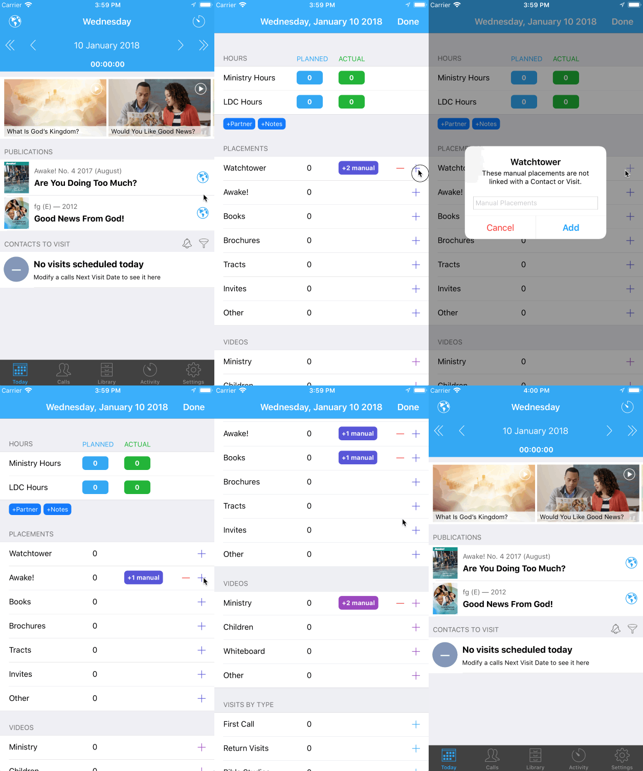
This is a highly requested feature – sorry I took so long. I considered many different options around this, but in the end decided that a lot of work and design had already gone into the Day screen available from the Calendar on the Activity screen. So I made some small changes to the way this screen works, and then integrated it into the Today screen.
So … now in the Today screen you can click the Activity button top/right, and enter your hours, witnessing partner, manual placements and more.
On the Day Planning screen you will now see new “-/+” buttons for the manual placements, videos etc. This change offers the following features:
- Click the “+” button to increment by 1 (one).
- Tap+hold on the “+” button to enter a typed number (as before).
- The “-” button will not show unless there is a value of 1 or more.
- Tap+hold on the “-” button to reset to 0 (zero).
- You can also tap on the value displayed to manually edit the amount.
Other Changes
There are many other minor tweaks and changes in this update. Just a couple worthy of mention:
- Fixed issue with the Annual Report not showing the Projected Hours correctly in some Time Zones
- Made the Timer bar slightly taller so that it is easier to tap
I hope this update helps you to be increasingly more effective in your ministry and get the most out of using ServicePlanner.
Positive reviews on the App Store are incredibly helpful. If you are enjoying ServicePlanner, and feel inspired to leave a review, it would be greatly appreciated 🙂
Thanks for your support.


